Chapter 3-16: Using GUI Features of the Image Editor |
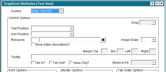
HTML Editor Widget Overview: The HTML Editor Widget can be used to enter and edit HTML in an APPX text field. The text field will contain the HTML code after the user has entered it. Design Usage: Use the Image Editor to add a text field to your image and resize it to be the size that you would like for your HTML Editor Widget. Then edit the GUI Attributes of the field and select "HTML EDITOR" as the control.
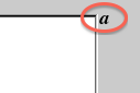
Show editor decorations? A check will always show the HTML editor toolbar/footer in the field. A blank will never show the toolbar/footer and will add an icon to popup a floating editor window instead. A ? lets the client choose which is best (default). In this case the client will look at the spec for "editorFullMinRows" (default 6). If the field is at least this many rows on the screen it will show the full editor with toolbars and footer in the field. If less than that many rows it will switch to no toolbars and footer and will add the popup icon. When the popup window fires it will default to a physical size that is based on two client properties "editorHeight" and "editorWidth" which default to 400 and 600 respectively. Once the popup fires you can move and resize it. All client settings are under [UIDefaults] and can be changed after login via .CLIENT LOAD URL. The icon for the editor popup will appear to the right of the first row of the field:
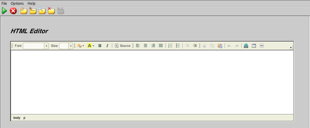
Runtime Usage: At runtime, the user will be able to enter text as if they were using a mini word processor. The saved text can be displayed later using a HTML VIEWER control, if desired.
Customizing the editor Appx uses the open source editor ckeditor for this widget. You can futher customize the capabilities of the editor (such as adding spell checking) by creating a custom configuration file. Refer to the documentation on the ckeditor website for creating a custom configuration file. Appx uses the 'compiled' format of the configuration file. As of this writing, Appx is using version 3.6.4 of CkEditor for Java. Once you have created the file, place it in the Resource directory of your application and add a Resource for it. The resource state should be EDITOR CONFIG, location type should be Design File and the Location data should be the config file name (case sensitive on Linux/Unix systems). Finally, add the resource to the HTML editor widget. You may have to log off & on again for the new configuration to take affect. This sample configuration file re-arranges the toolbar and adds spell checking:
{ |
Application Design Manual "Powered by Appx Software"1311 ©2006 By APPX Software, Inc. All Rights Reserved |